cat-users AT lists.geant.org
Subject: The mailing list for users of the eduroam Configuration Assistant Tool (CAT)
List archive
- From: Gerrard Shaw <address@concealed>
- To: "address@concealed" <address@concealed>
- Subject: [[cat-users]] CAT-Test (beta) UI feedback
- Date: Tue, 11 Sep 2018 11:23:05 +0000
- Accept-language: en-GB, en-US
- Authentication-results: prod-mail.geant.net (amavisd-new); dkim=pass (1024-bit key) header.d=hcfhe.onmicrosoft.com
- Authentication-results: spf=none (sender IP is ) address@concealed;
- Spamdiagnosticmetadata: NSPM
- Spamdiagnosticoutput: 1:99
|
Hi all,
Just joined the list after being advised it’s the best place for providing feedback on the (much improved) new interface being tested for CAT.
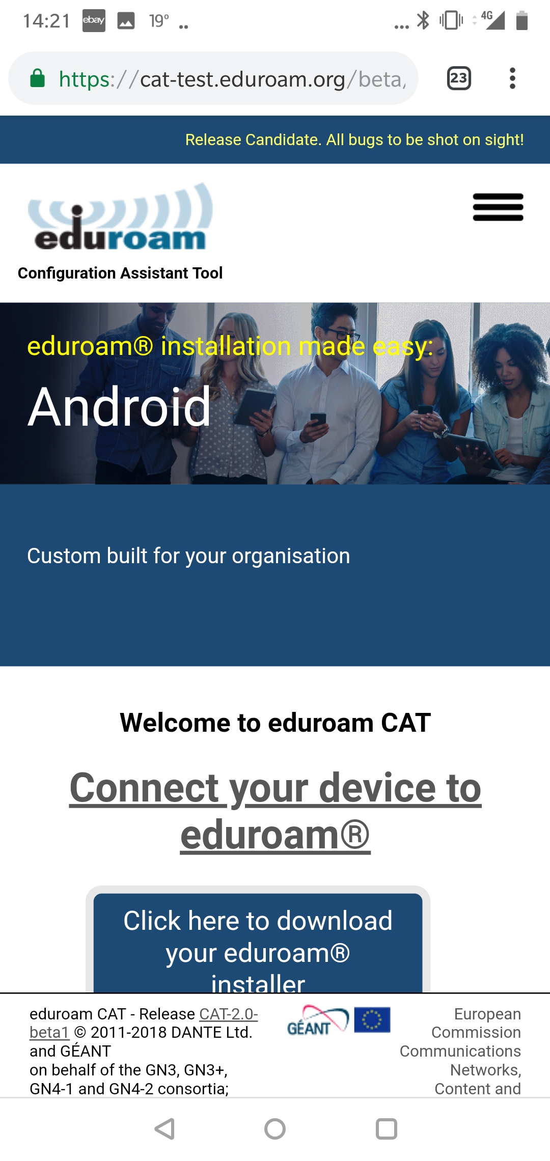
We’ve just launched eduroam at our organisation but currently looking at the CAT beta to make screenshots for users ready for the full launch. Trying it on my Android phone (OnePlus 6) noticed a few UI tweaks that could do with improvement. Screenshot attached for reference.
1)
The download button is partially covered by the footer 2)
The download button looks a bit too far down the page to be the obvious control to click on, if anything it seems “Connect your device to eduroam” which granted does do the same thing. Having two clickable elements doing the same function
seems a bit superfluous? 3)
The blue section underneath the image banner is a bit too large when viewed on a smartphone and pushes the download button out the way, can it be reduced? 4) The introduction text “Custom built for your organisation \ Digitally signed by the organisation that coordinates eduroam®: GÉANT Association” doesn’t really mean much to the end user whereas the phrase beneath “Connect your device to eduroam” is much clearer. Perhaps consider swapping that text into the banner, which would free up space for the download button to be more prominent?
As I say more tweaks than anything and it’s leaps and bounds ahead of the current CAT interface, which I’ve had a few users tell me looks like malware (!)
Regards,
Gerrard Shaw Network Support Officer Havering College of Further and Higher Education Ardleigh Green Road Hornchurch, Essex RM11 2LL DDI: 01708 462 757
This message is sent in confidence for the addressee only. It may contain confidential or sensitive information. The contents are not to be disclosed to anyone other than the addressee. Unauthorised recipients are requested to preserve this confidentiality and to advise us of any errors in transmission. Thank you. Please note that the College reserves the right to monitor emails for the business purposes contained in the Telecommunications (Lawful Business Practice) (Interception of Communications) Regulations 2000, that is: to establish the existence of facts relevant to the business of the College, to investigate or detect unauthorised use of the systems; to maintain the effective operation of the system; to detect any computer viruses; to check the mailbox of any absent employees; or to prevent or detect a crime. To be able to exercise these rights, the College must have made all reasonable attempts to inform every person who may use the system that monitoring and interception may take place. This College regards this notice to you as notification of such a possibility. |
Attachment:
Screenshot_20180910-142131.jpg
Description: Screenshot_20180910-142131.jpg
- [[cat-users]] CAT-Test (beta) UI feedback, Gerrard Shaw, 09/11/2018
- Re: [[cat-users]] CAT-Test (beta) UI feedback, Benutzersupport - Lukas Wringer, 09/11/2018
- Re: [[cat-users]] CAT-Test (beta) UI feedback, Tomasz Wolniewicz, 09/18/2018
- Re: [[cat-users]] CAT-Test (beta) UI feedback, Tomasz Wolniewicz, 09/19/2018
- Re: [[cat-users]] CAT-Test (beta) UI feedback, Darren Wheatcroft, 09/20/2018
- Re: [[cat-users]] CAT-Test (beta) UI feedback, Tomasz Wolniewicz, 09/20/2018
- Re: [[cat-users]] CAT-Test (beta) UI feedback, Alan Buxey, 09/20/2018
- Re: [[cat-users]] CAT-Test (beta) UI feedback, Tomasz Wolniewicz, 09/20/2018
- Re: [[cat-users]] CAT-Test (beta) UI feedback, Alan Buxey, 09/20/2018
- Re: [[cat-users]] CAT-Test (beta) UI feedback, Zenon Mousmoulas, 09/20/2018
- RE: [[cat-users]] CAT-Test (beta) UI feedback, Gerrard Shaw, 09/21/2018
- Re: [[cat-users]] CAT-Test (beta) UI feedback, Tomasz Wolniewicz, 09/21/2018
- Re: [[cat-users]] CAT-Test (beta) UI feedback, Tomasz Wolniewicz, 09/20/2018
- Re: [[cat-users]] CAT-Test (beta) UI feedback, Darren Wheatcroft, 09/20/2018
- Re: [[cat-users]] CAT-Test (beta) UI feedback, Tomasz Wolniewicz, 09/19/2018
Archive powered by MHonArc 2.6.19.